


All IN TO VOTE
Case Studies Project
1.
About Goal
My mission is to close the electoral participation gaps that persist across race and age groups. Through a carefully crafted program offering structure, support, and recognition, the ALL IN Challenge empowers colleges and universities to enhance civic learning, foster political engagement, and boost voter turnout.
2.
About Audience & Research
School students and young adults aged 18-25 have just become eligible to vote, but many may not see it as a priority. They often just need a little encouragement to participate...

3.
Ideations & Ref
I investigated many traditional voting posters. Most of them emphasize the font itself. In these posters, the eye-catching slogan is the most important part. The intention of the poster authors is very clear, "speaking directly to the audience". This inspired me and made me decide to create a poster in this way.

“your era,your voice”

This era belongs to young people. Tell young voters that they should be the voice of their generation, not let the older generation make decisions for them.
The simple interface allows for flexible animation ideas, with elements appearing step by step to easily guide the audience's attention.
“If we‘re one vote short.”

If we’re one vote short, will you still stay silent? The best way to motivate young people who think votes don’t matter is to bluntly tell them that maybe this vote could change the outcome.
The animation will revolve around the font, as it should be the first thing noticed in a poster.
4.
Refinement

Version 1

Version 2
Version 3
Finally settled on the idea of "your era, your voice". But I also needed to make some changes. There were two main problems:
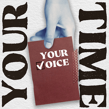
1. "your era, your voice" doesn't sound like it fits the positioning of young people, so I changed it to "your time, your voice",
2. The colors in the picture are too monotonous, and having a specific color for each hand may cause dissatisfaction and loss of identity among the audience.
5.
Animations
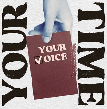
After the first animation, I received suggestions from the creative director, and I reduced the font size to make it easier to read, changed the fonts to make them more consistent with the textures, and finally, I simplified the animation.


6.
Technical Development
I mainly use AE for animations, please see the following description for details.

I mainly used the stroke effect here to create a handwritten check effect.

Add a range selector and control font spacing to complete the font stretch animation.

Combine animations of different compositing paths and adjust the speed of the music to match the animation effect
7.
Result & Mock up
In terms of mock up, I try to view my work from the perspective of a mobile phone to ensure it can be viewed properly on a mobile phone.

